After the 1929 stock market crash, no big architectural commission was in sight for Dutch architects Brinkman and Van der Vlugt. Thus the duo was able to devote much time to the design of a house whose project started on the first year of the economic crisis. The Sonneveld’s is today a well preserved example of Nieuwe Bouwen, (a Dutch version of functionalist housing): a modern house in which the Le Corbusier’s five points were enriched by an unusual warmth in the interiors.
The substantial set of design drawings for this building has been well preserved, documenting not only the design process but also the interactions between the architects and the clients. The architects took over every detail in the interior layout, even deciding how the furniture was to be arranged. When the family moved in in 1933, they brought almost nothing from the old house: in fact they made the conscious choice to “live modern” and bought brand new furniture, such as the tubular steel chairs and tables from the Dutch company Gispen. The house was also provided a (for the time) unusual set of gadgets, like the audio system usable from every room, electronic devices to call the servants (who lived separetedly from the rest of the family), a small elevator to get the wood from the basement to the fireplace in the living room and even a shower with ten shower heads.
A careful study made in collaboration with the Sonnevelds, the project of the house reflected the family’s lifestyle, to the point of finishing each room in different colors to match the preference of each member.
From the Rudy/Godinez description (author unknown): “The house’s interior is characterized by warm, clear hues – vermilion, cornflower blue and egg-yolk yellow – in combination with light and dark grey and brown. For the soft furnishings, the architects used a color range selected by the designer Bart van der Leck. In the living room and library, a yellow office chair and orange-red armchairs create accents against the neutral background of bronze, brown and beige. In the bedrooms and dining room, the reverse is true. Here, bright colors are applied to the large surfaces – red cabinets, blue curtains, yellow on the floor – while the table and chairs are in the neutral shades of natural wood, black, gray and chrome.”
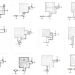
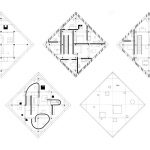
(Plates from top)
1) Interior design for the kitchen
2) Interior design for one of the bathrooms
3) Interior design for the hall
4) Interior design for the daughter’s bedroom
5) Interior design for library


Further:
The Sonneveld House Museum (Plans, Sections, Elevations here)
(Drawings Via) Sonneveld House @ Rudy/Godinez
Huis Sonneveld @ ArchitectuurPlaquette
Richard Hutten @ the Sonneveld House. Also in Yatzer.com
(Most Photos Via) Sonneveld House @ Batikk.be
Remembering Iamsterdam
A video tour


Leave a Reply